
Create beautiful lists of Salesforce records with FlexCards. This post is part of the FlexCard Design Thinking mini series.
You can create FlexCards that provide a user with access to actions:
- A link to navigate to a record, page, or URL
- A button that opens an OmniScript in a modal window
- A button that opens another FlexCard in a modal window (maybe for more details)
- A button that opens a LWC
- A bar of actions that only apply at certain times (not easy to do otherwise in Experience Cloud sites)
There are actually lots of different kinds of actions and modes for controlling what happens/how the next window appears.
Benefits / Lessons I Learned
- I can conditionally display or hide action buttons. For instance, in Example #2, the green “Submit My Application” button doesn’t appear unless the status for all the other sections = Completed. Actually, the whole header of that FlexCard is conditional – it shows a different headline and instructional text while the applicant is completing the application.
- From one FlexCard, I can open another FlexCard as a pop-up/modal window.
- FlexCards are a great way to break up OmniScripts and create more asynchronous processes for our customers. I don’t like long OmniScripts with a lot of complex data entry – I don’t think that’s how people want to provide information. Grant applications, tax returns, etc. get filled out over many, many days, as paperwork and other inputs are gathered. So we need a more asynchronous way to start and then return to an application. I don’t like paused Flows, and I don’t like OS “Save for Later” feature either. I would rather have a customer start a record in a draft state, and then come back to it as often as needed to complete all the requirements. Then, when they are done, we’ll let them submit. Example #2 does this:
- I have different types of data I want to collect, so I make a bunch of short OmniScripts that can be completed in one sitting or easily revisited. These “sections” of my application have a corresponding status field on my application record, and each OmniScript updates this status when it completes.
- I create a FlexCard that only really pulls in the application’s status field values for each section. Then, whenever they are all marked “Completed”, I conditionally show a submit button. Clicking that opens an OmniScript that updates the record to a “Submitted” status.
- Flyouts are out, pop-up modal windows are in. Well, actually flyouts display inside the layout and modals display outside. Look, nevermind. Point is, I avoid flyouts. Modal windows are a much better user experience, especially for process-driven actions where you want to mute distractions on the page and limit your user’s behavior until they complete an OmniScript or finish reviewing the pop-up’s content.
- Redirects to record pages are automatically configured for internal LEX and Experience Cloud record pages. You don’t need to do anything to properly format a link to open a record page. The card does it for you! This is a big deal, because when building custom components you have to account for the different URL paths that have to be followed to get to a record, depending on where you are using the component. Not with a FlexCard! Oh, happy day!
Example #1 – Actionable “Configurator” Card Used in a LEX Console App
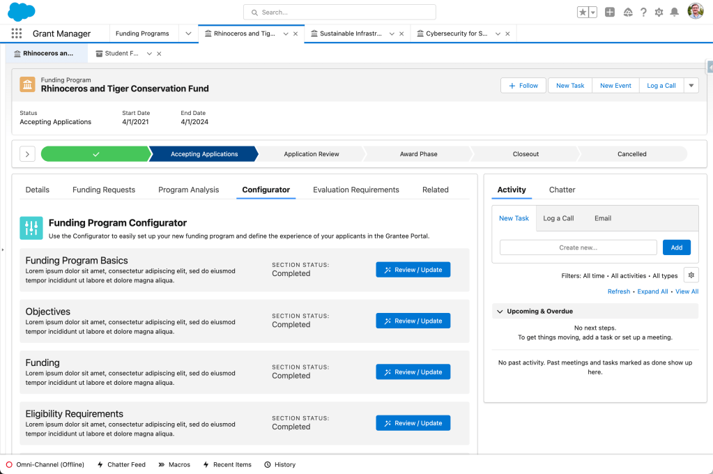
Example #1 shows a “Configurator” that the user will use to populate a record – in this case, configuring how a grant program will work. It provides curated, organized access to the record’s fields and related records.
Each of these action buttons opens a related OmniScript or FlexCard for setting up different parts of the grant program.
Example #2 – Actionable “Application Workspace” Card with Conditional Buttons Used in an Experience Cloud Site

Example #2 shows a similar concept, but aimed at facilitating an external user who needs to complete a grant application. Once their draft application is created, this “Application Workspace” guides them to complete different sections of the application before being allowed to submit.
The green “Submit My Application” button only shows up once all of the applications sections have been completed. Each section has a status field on the record that helps control the conditional visibility.
Bonus content: see the FlexCard in the sidebar? There’s a Funding Program field with a link. That link is actually a FlexCard action.
Example #3: Pop-up FlexCard from a FlexCard!

This is a continuation of Example #2. It shows how, when you click the button to complete the “Objectives & Performance Measures” section of the application, the modal/pop-up that displays is actually just another FlexCard!
It wasn’t appropriate to include all of this detail on the main FlexCard – that would be too busy – so the action button allowed the user to open this card to carry out the detailed work of this section.
The action buttons and links on this FlexCard open OmniScripts that allow the user to create, edit, and delete performance measures for each objective.
Author’s Note: I fully admit this example is more complicated and maybe even overly so. If it bends your mind to think about cards begetting cards begetting OmniScripts, just give your mental Etch A Sketch a shake and return your focus to a simpler example.
 This Old Cloud
One thought on “FlexCard Pattern #5: Presenting Actionable Buttons and Menus”